I’ve been riding motorcycles for years. I’ve bought several — always in person, always able to touch the bike before making a decision.
I wanted to see what that online experience would feel like with a VARG. A premium product, electric technology, a young brand, and no physical dealership to answer questions. What I found gave me the material for this case study.
Stark Future builds the most powerful electric motorcycles on the market. Their website sells directly to the consumer. That means the purchasing experience isn’t just a detail — it is the business.
I navigated the site as an interested rider with no prior knowledge of the brand. With fresh eyes. I found two points of friction that, with minor tweaks, could significantly elevate the user experience.

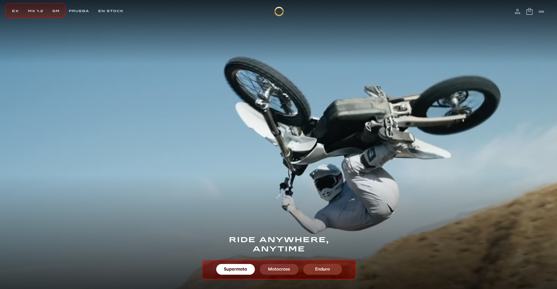
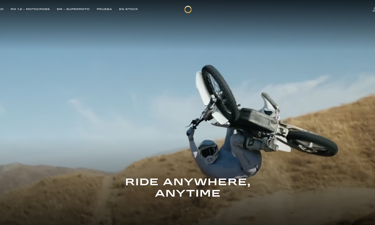
The header presents three options: EX, MX 1.2, and SM. No description, no context. To an industry insider, these acronyms are obvious. To everyone else, they’re just letters that don’t mean much. Upon browsing, they turn out to be Enduro, Motocross, and Supermoto — but the naming convention doesn’t match what you see in the navigation. The site forces the user to explore just to understand something that should be crystal clear from the very first second.
The website jumps straight into hard-sell mode. That works for someone who already knows Stark and came specifically to buy. It doesn’t work for someone who is still weighing their options.The value proposition and 'reasons to believe' appear after the configurator — when you’ve already asked the user to make a decision. Information architecture matters just as much as the content itself.
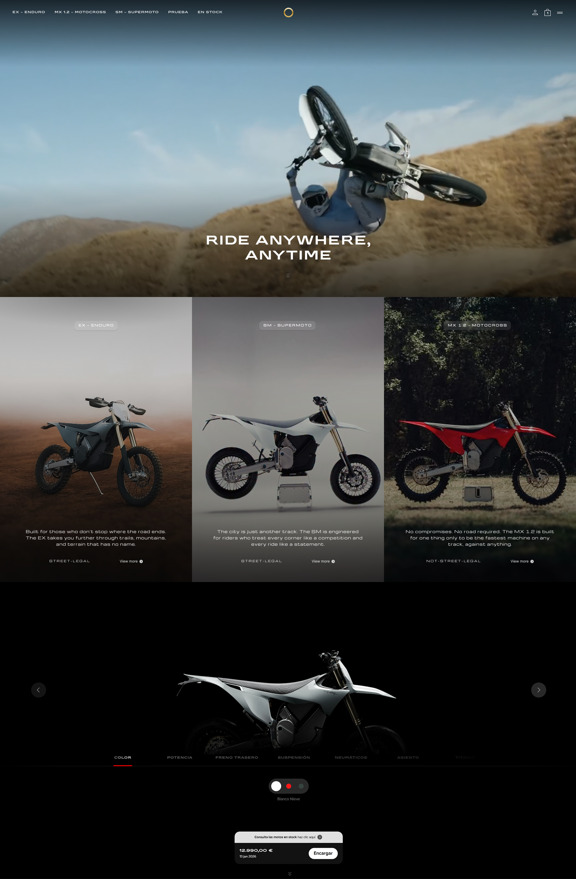
The solution is simple: provide context before forcing a decision, without adding friction for the user who is ready to buy. I transformed the three hero options into their own dedicated section. More breathing room, better context, and two clear pathways: explore or configure. The user dictates their own pace.
This case study wasn’t born from a brief. It came from browsing a site as a real user and asking myself how I could improve something that is already objectively good.
The process led me to apply two fundamental UX principles. First: Information Hierarchy — it’s not just about what content exists, but the order in which the user encounters it. Second: Designing for multiple mental models — not all users arrive at the same stage of the customer journey, and a strong system offers different paths without forcing any of them.
The answer is rarely found in visual design. It lies in the structure, the architecture, and knowing exactly who is on the other side of the screen — and where they are in their decision-making process.