This case combines firsthand rider observation with structured external research. I used Gemini Deep Research to synthesize behavior patterns and direct feedback from motorcycle forums, reviews, and specialized communities. AI accelerated my judgment — it didn't replace it.
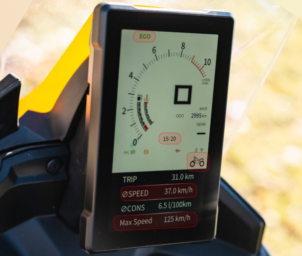
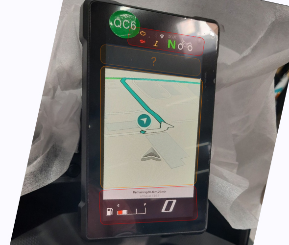
Modern motorcycle dashboards have technologically evolved at a pace their interfaces haven't kept up with. More features, more information, more connectivity. But more isn't always better.
This case study explores what an interface designed from scratch for real-world riding conditions should look like — not for the showroom, but for the road.
As a daily rider, I experienced this problem firsthand — poorly structured information, delays, excessive screen engagement. External research revealed this isn't an anomaly; it's systemic across the industry.
Modern riders need interfaces that inform without competing for attention. Current systems demand more than riders should give.
Two recurring patterns across riders, brands, and markets:
Feature Bloat: Manufacturers apply mobile design logic to a radically different context. The result: screens layered with functions that ignore actual riding conditions. It's a category error — treating a motorcycle HMI like a smartphone.
Data Disappears: When the map takes over the full display, speed, battery, and alerts vanish. The rider faces a false choice: navigate or monitor. That choice should never exist.
The modern rider needs an interface that informs without competing for attention — because riding already demands 100% of their focus, and current systems ask for more.
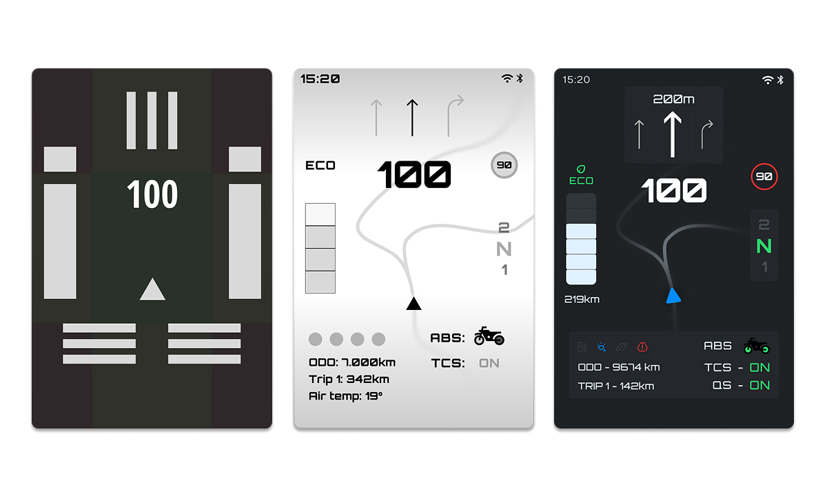
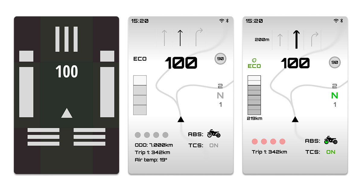
1 — Information hierarchy by cognitive load
2 — Designed for zero distraction while riding
3 — Critical data remains inviolable
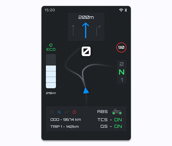
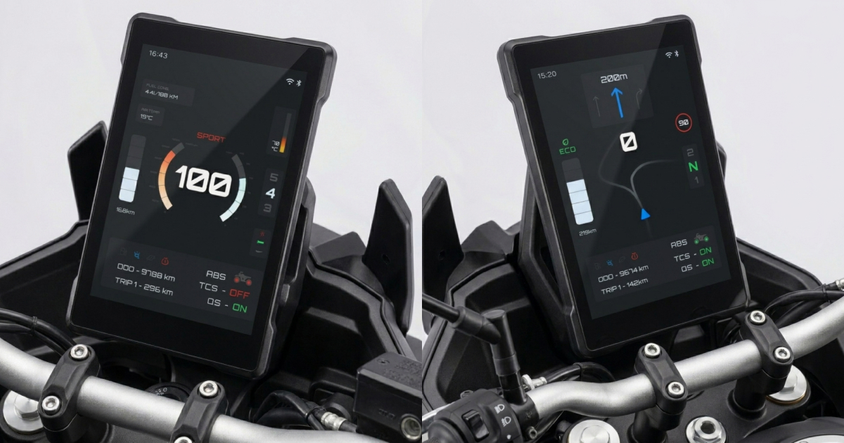
Riding Mode — bike in motion. Minimal interface. Critical data only. Controlled from handlebars. The navigation arrow dominates the upper third — it's the largest element because it's the most urgent. Speed sits center. Speed limit, gear, fuel, and system status are present but subordinated. The map is background, never the protagonist. Nothing requires touching the screen.
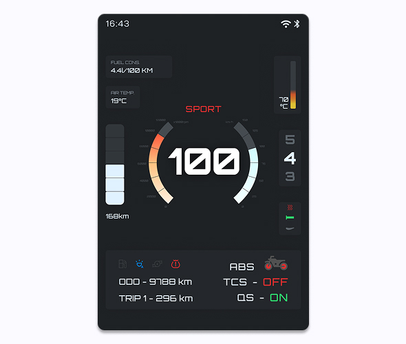
Performance Mode — the rider who wants bike data. A circular speedometer integrates RPM and speed in a single read. Engine temperature, consumption, and ambient temperature provide context for real performance. Active mode displays over the speedometer. No navigation here — in this mode, the rider already knows the route. What they need is to know how the bike breathes.
Designing for a motorcycle isn't designing for mobile on a smaller screen. It's designing for a context where a hierarchy error can have real consequences.
That constraint isn't a limitation — it's the clearest brief a designer can get. Every element must justify its presence. What doesn't add, subtracts.