To take the next step, he needed something he lacked: a brand that spoke for him, even when he wasn't in the room. His main channel was social media, so that became our playing field.


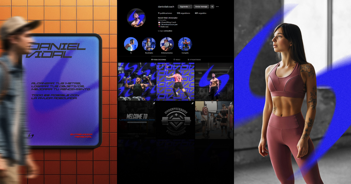
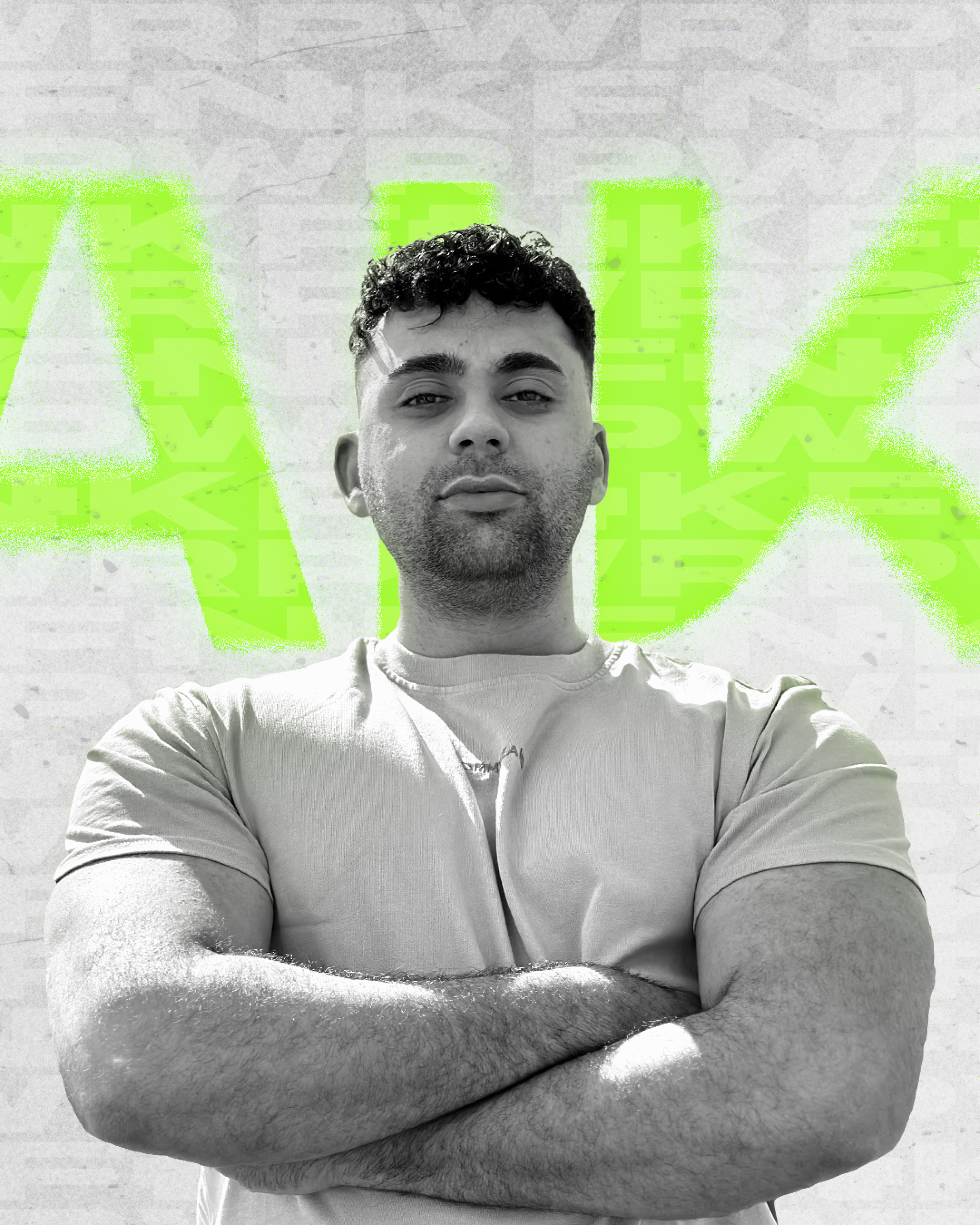
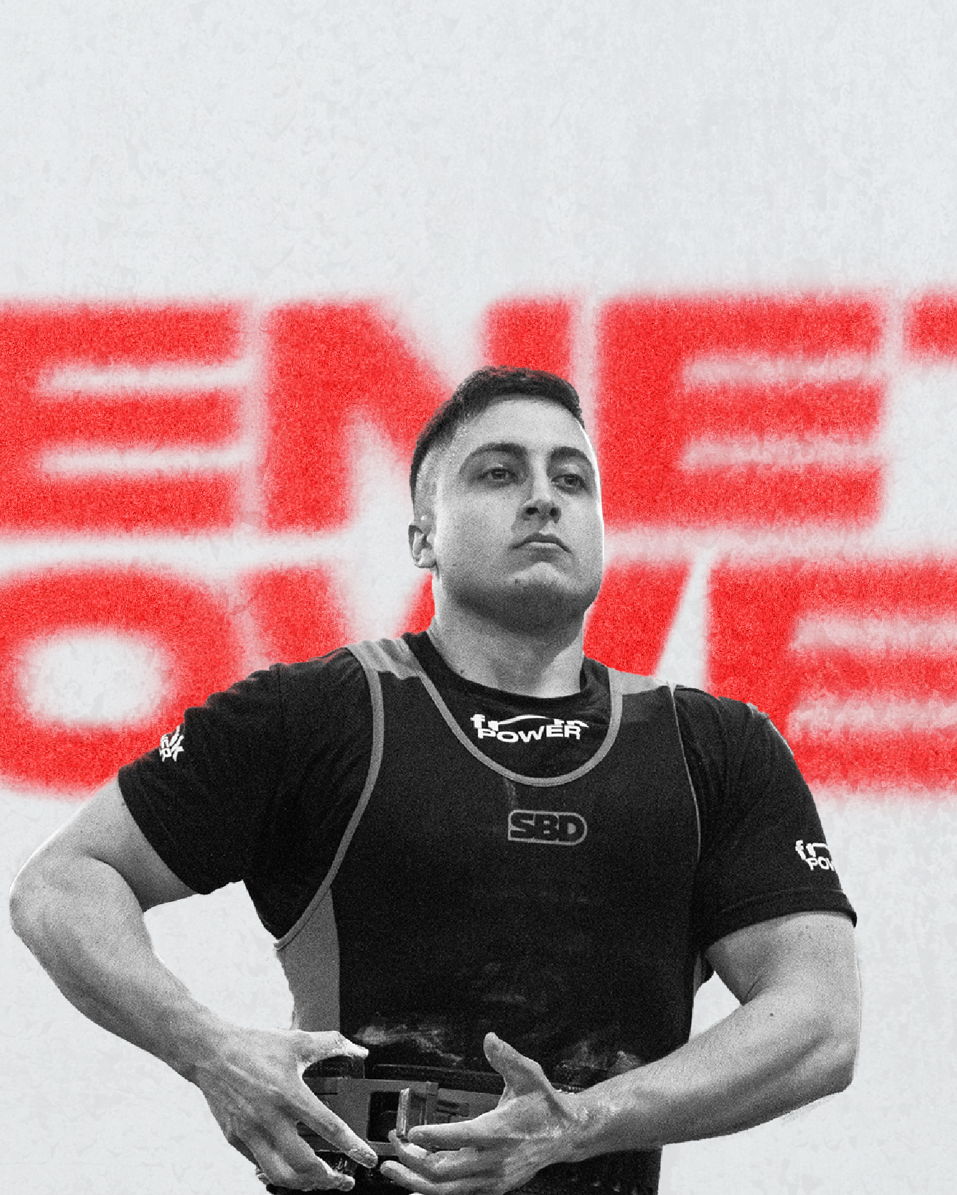
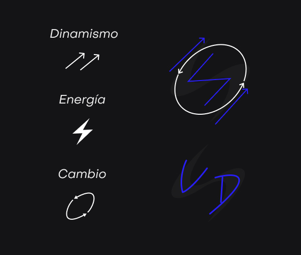
Before designing anything, we defined what the brand needed to convey: energy, dynamism, and transformation. A young, modern profile with its own personality. A personalized and approachable service, keeping in mind that it would be competing visually in an infinite scroll.
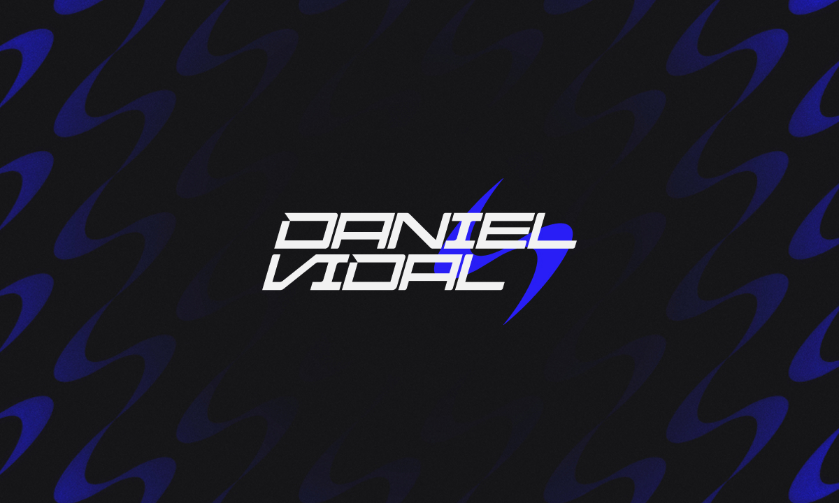
The logo's typography was customized by hand, starting from the Siegra typeface and refining it character by character.
The detail that makes it unique: The icon.
The D and V of Daniel Vidal merge into a single shape alongside a spiral — a symbol of movement, the fundamental principle of sports. It’s not just a logo. It’s a concept that carries his name.
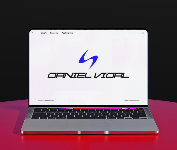
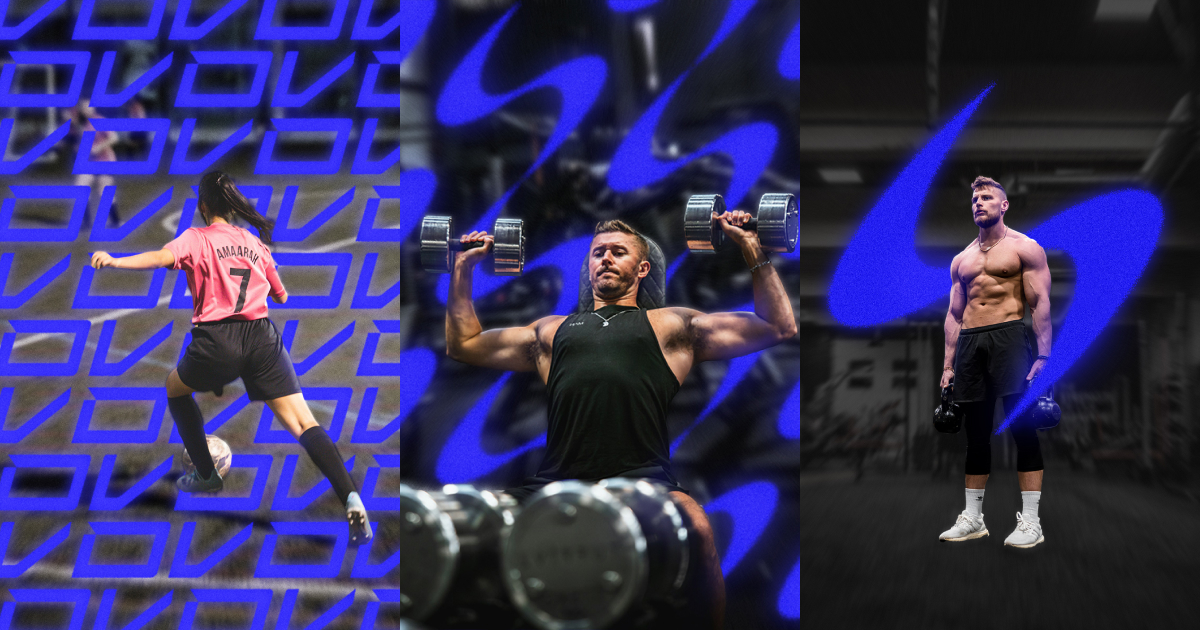
An identity Daniel didn’t have to explain — it spoke for itself. Across his profile picture, covers, posts, and stories, the brand created immediate visual consistency.
In the following months: better brand perception, a 15% increase in followers, and a slight but real boost in new clients. But perhaps most importantly: Daniel felt more motivated than ever. A brand that truly represents you is also fuel.